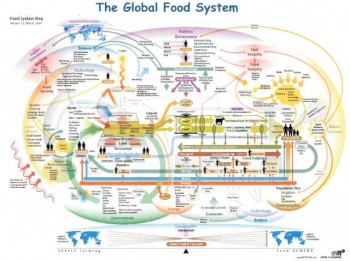
The world’s human food system is a complicated matrix of supply, demand, economics, transportation and politics, among many other factors.
But now, graphic artists at ShiftN.com. have attempted to visualize the system, creating a chart—or map—of the myriad factors that make up the world’s dizzying array of variables that go into the process.
“This map visualizes the global interconnections among food, agriculture, water, energy, soil, and humans that comprise our food system.
“What fascinates me about this map is how I discovered it,”said Danielle Gould, of FoodTechConnect. com.” and how that process demonstrates an opportunity for information technology to connect us with the information, people, and resources necessary to address pressing global food and environmental challenges.”
FoodTechConnect.com is working to establish open agricultural information on a worldwide basis.
“I stumbled upon this graphic in a presentation from the Workshop on Skills and Translation of Agri-Food Research (PDF, 742k,48 pages) in the UK,” wrote Gould on her website in mid-July,”which I located through a Google search for open agricultural research in the UK. In effect, Google enabled me to quickly and effortlessly discover that the open agriculture conversation is already underway across the ocean.”
The ShiftN map spread around the ‘Net rapidly on Thursday, July 22, when food author Michael Pollan picked it up and tweeted it to his thousands of followers.
He described it as a “cool graphic” but offered no analysis.
As readers might agree, that would take quite a bit of time.
Here it is in miniature, so to speak:

And here is the link to the larger chart.